Are Captions More Accessible on the Top of the Screen?

hearing loss captions accessibility
HHTM
September 27, 2022

Where should the caption window be located for the best accessibility? I had not given this issue much thought until my recent visit to Washington DC.

It was a terrific trip. We toured the U.S. Capital and enjoyed many wonderful museums including the newest addition to the Smithsonian, the National Museum of African American History and Culture. Everywhere we visited was accessible for people with hearing loss. The ticket counters were looped, and all video content was open captioned. It was a pleasure.

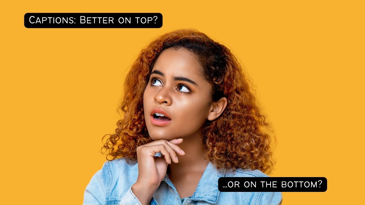
But it raised an interesting question. What is the best placement for public-facing captions—on the bottom of the screen, as is typical for television and social media, or on the top so they can be seen from the rear?

Public Captions on the Bottom Can Be Hard to See

I lean to the left. I lean to the right. The people seated in front of me are tall and given my shorter stature, it is hard for me to see the captions on the welcome video at the U.S. Capital. The captions are on the bottom of the screen, as is typical for captioned media, but because of this, they are hidden by those seated in front of me in the auditorium.

A similar thing occurred at the museums, where I needed to shift side to side behind taller visitors to read the captions on the video exhibits.

We learned this caption placement lesson firsthand at the screening of our hearing loss documentary We Hear You at the 2022 Hearing Loss Association of America (HLAA) Convention. The room was set up classroom style, so the screen was not elevated. Once the movie began, we quickly realized that everyone beyond the first few rows was having trouble viewing the burned-in captions on the bottom of the movie.

Luckily, a CART reporter volunteered to add real-time captions at the top of the screen so they could be seen by everyone. Thank goodness for her. 

For Private Use, Captions are Often Movable

When using captions at home, we have options. For example, the Zoom caption window can be moved anywhere on the screen with a simple drag and drop. I always move the caption window to the top of the screen because they are easier for me to see, and the top-of-the-screen location helps me look more attentive on the call. Rather than looking down (to read the captions) I am seen with my eyes forward and engaged.

You can also reposition the caption box on YouTube videos or when using the Live Caption accessibility feature in the Chrome Browser. Again, just drag and drop. 

Television captions are more challenging, but there are usually ways to adjust both the location and size. The process varies by cable provider and can be tedious and frustrating but is worth the effort if you watch a lot of sports. In the United States, the FCC sets standards for caption accuracy, synchronicity, completeness and placement. Report problems here.

Should We Change the Standard?

More research is needed to see if my experience is the norm, but if captions in public spaces are more accessible on the top of the screen, how can we help change this standard? We can start at home, by captioning our own videos in this manner. 

Readers, what do you think? Are captions more accessible on the bottom or top of the screen?


Shari Eberts

Shari Eberts is a passionate hearing health advocate and internationally recognized author and speaker on hearing loss issues. She is the founder of Living with Hearing Loss, a popular blog and online community for people with hearing loss, and an executive producer of We Hear You, an award-winning documentary about the hearing loss experience. Her book, Hear & Beyond: Live Skillfully with Hearing Loss, (co-authored with Gael Hannan) is the ultimate survival guide to living well with hearing loss. Shari has an adult-onset genetic hearing loss and hopes that by sharing her story, she will help others to live more peacefully with their own hearing issues. Connect with Shari: BlogFacebookLinkedInTwitter.

  1. Often, during TV news commentary programs, the name of the speaker is displayed momentarily at the bottom of the screen. But the captioning is also placed at the bottom and obscures the name of the speaker. I struggle to read through the captions to see the person’s name and title. Then, the name disappears. I hope to catch the person’s name during the interview or at the end of the interview. But for some reason, captions don’t usually caption the person’s name even if the interviewer says the name. The captions read “Thank You” instead of “Thank you John Doe”.

    Thank you for bringing alternative caption placement choices to light, Shari.

  2. I agree that captioning on the top may work better as many networks insist on adding many banners and constantly adding more advertising on the bottom. This makes the captioning for the “real” content I want to watch cluttered and sometimes impossible to see let alone read as they push the advertising on the top layer. 🙁 I think I will try moving my personal TV captioning to the top to try this placement. Giving up on moving placement as it does NOT appear to be an option. 🙁

  3. Whether captioning should be on the top or bottom is an issues that needs addressing, but I think there is a much more serious problem with captioning out there that is not being addressed as far as I know. I filed 3 complaints with the FCC about 5 years ago about captioning that were totally blown off. Several years ago, I found someone that was more interested in my complaint but I could hardly file a new complaint since I had not bought a new television, which is what I would have needed to do. I was just told that my issues would be brought to some committee’s attention, but never heard anything again.;

    If one uses cable television to get television, they may be just fine with the outcome of captions on their set. I am not sure what cable companies offer anymore, but once upon a time, because the signals came from a cable wire, one had an option to get two basic kinds of signals (one good and one bad really). But if someone is using an outside attena rather than cable, there are serious problems with most of the televisions being produced today.

    Older television sets made 10-20 years ago all had the comparatively readable rollup captions. Today, the only television brand that has this comparatively readable rollup captioning is Sony, while Samsung’s is almost as good (and some people have told me that Samsung is just as good now, but I have not seen such a set to verify). All of the other sets only have the difficult-to-read roll up captions and all the customizing in the world does NOT fix the problem. In one of my complaints to the FCC, one manufacturer justified the difficult-to-read captioning as “personal preference.” There is no way that anyone would prefer the jerky, line appearing, line disappearing captioning as

    I am I am going to send you just one video link and this should make it plain about the problem (hope the link still works). For news, sports and most talk shows or anything produced live, the captioning is needed comparatively soon and what is used is oftentimes referred to as “roll-up” captioning (as opposed to pop up captioning). Roll up captioning is where there are serious readability problems while pop up captioning is generally acceptable.

    Click on the link and start the video and see how hard it is to read the rolling captions. DO NOT Click on the CC option!

    https://www.youtube.com/watch?v=0JUGe_3gn5I

    You will notice that as the lines roll up towards the top, they disappear and reappear with a lot of jerkiness making it very hard to read. After reading these captions for awhile, DO click on the CC option. You will get double captions at that point, but towards the bottom, you will see roll-up captioning that is very readable. Notice how very readable it is in comparison to the higher up rolling captions.

    I have been told that there are two basic types of roll-up captioning signals. The older type of signal provides the easy to read roll up captions and the newer signal does not provide the easy to read roll up captions. Why the Sony and to a degree the Samsung can produce the more readable rollup captions while the other manufacturers cannot is not clear to me since I am not technically knowledgeable. But, those sets that cannot pick up the more readable signal from an antenna can supposedly, in some cases pick up the older signal, when one has cable television service and get good captioning that way. This is why my last FCC complaint was blown off–I was told to get cable television when I am perfectly happy with my over the air signal and don’t want to waste my hard earned dollars taking cable television.

    One other thing I want to clarify is that the sets that produce lousy roll up captioning appear to have perfectly fine “pop up” captioning which is mostly used for movies and regular series that are shown weekly. News, sports and talk shows cannot use pop up captioning because of the time it takes to produce pop up captioning. Hence a lot of hearing impaired people, while they can enjoy regularly scheduled shows that are produced way in advance of showing can get perfectly good captioning for that purpose, but then get unacceptably poor captioning for news, sports and talk shows.

  4. Captions at the top would help so much! For us News Junkies, the scroll at the bottom conflicts with CC

  5. Hi Sheri, so glad you raised this. Frankly, I think many captions-users remain at the point of simply being relieved when there are captions at all, and even more relieved if they present accurately and in time with the audio! That’s still a big battle in itself.

    But I feel you are right to be looking at placement. It will shift the dialogue and take things up a level. We should be able to trust and assume captions will be available. It should be a MUST.

    Now it is time for us to also seek captions that give a better user experience and talking about placement can help us do this. It moves the discussion forward – which might also give confidence and raise the expectations among those of us who feel humble and relieved when captions even appear!

  6. The captions belong at top of screen so that we can absorb the entire picture, not just words.

  7. Another thing of interest is that when I am using the program guide on my TV, I cannot see the full details of a possible movie for example since the bottom captions of the program currently playing are interfering.

  8. I find captions at the top run right over people’s faces, thereby losing me part of their body language/expression. I don’t have the option of moving my CCs around on my TV system, so if they wind up on top for whatever reason I’m stuck with reading the TV instead of watching a show.

Leave a Reply